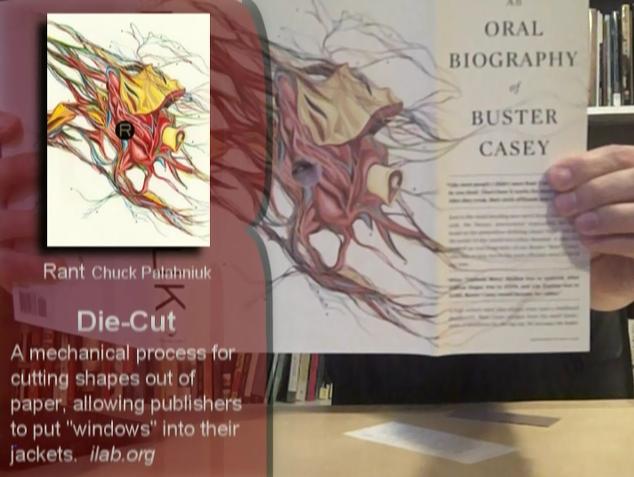
In this episode I examine two examples of book design: the die-cut cover and the photo finish (or ImageWrap) while touching on the the embossed hardcover. Examples include Denis Johnson’s Nobody Move, Chuck Palahniuk’s Rant, Donna Tartt’s The Little Friend, Tim Etchells’ The Broken World, Brian Evenson’s Baby Leg, and Will Christopher Baer’s Hell’s Half Acre.
Book design, Die-cut and Image Wrap book covers (Video Blog Ep 012)
Comments
One response to “Book design, Die-cut and Image Wrap book covers (Video Blog Ep 012)”
I have all three of those Will Christopher Baer hardcovers in the Phineas Poe trilogy from MacAdam/Cage (courtesy of Richard Thomas; thank you). You might be interested to know that both “Hell’s Half Acre” and “Penny Dreadful” are printed with the titles on their spines going the “correct” direction (from the top down), while the author names are flipped from the bottom up (why?); meanwhile the first book in the trilogy, “Kiss Me, Judas,” both the title AND the author are printed the “wrong” way, from the bottom-up. It’s quite unnerving to see them together on the shelf that way.